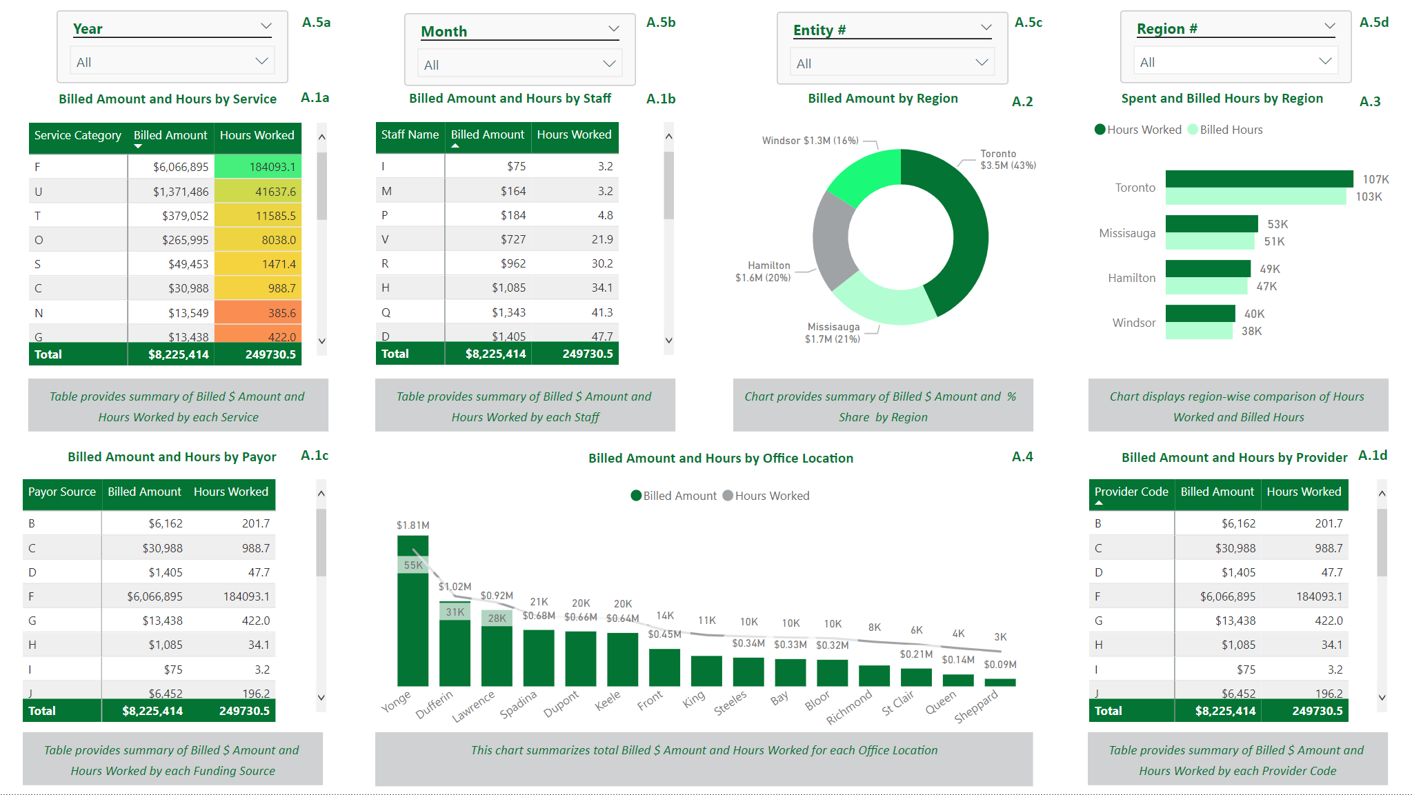
Exhibit A: A PowerBI dashboard with: A.1 Matrix Visuals; A.2 Donut Chart; A.3 Bar Chart; A.4 Combo Bar-Line Chart; A.5 Slicers
Microsoft’s Power BI platform is an efficient tool for data visualization, allowing users to have a more “hands on” approach when working with large datasets. Choosing which KPIs to model are an essential first step in deciding a dashboard’s layout and are often found through discussion with clients or by conducting industry research. A vast range of KPIs can be modelled in Power BI, including but not limited to:
Financial KPIs
- COGS Breakdowns
- Working Capital Forecasts
- Accounts Receivable/Accounts Payable Breakdowns
- Days of Sales/Payables Outstanding
- Inventory Turnover
- Financial Ratios (Current, Quick, Cash, etc.)
Sales KPIs
- Daily, weekly, monthly revenue (net or gross) by product sold or by customer
- Individual product sale metrics
- Number of New Customers
Other KPIs
- Hours Worked by Staff
- Appointments made and future scheduled appointments
- Phone answer rates and call durations
- Total compensation as a percentage of revenue
- Conversion rates
Comparable Transaction
Power BI has a multitude of built-in visuals useful for modelling KPIs – examples include matrices in Exhibit A.1 to show data points for locations or over days/months, or simpler visuals such as a donut chart in Exhibit A.2 or bar chart in Exhibit A.3 to display aggregates. Line charts are an effective way to model trends over time-periods and can be incorporated with bar charts if the combination is desired, such as in Exhibit A.4.
These slicers can be seen in Exhibit A.5 and allow for “slicing and dicing” of data, allowing the user to dig deeper into the report. Slicers may also be modified so that they do not affect certain visuals (i.e., if there is a visual that the report builder does not want to be affected when a slicer is activated). This specific modification can be found in Power BI’s header, under the Edit Interactions label.
Oftentimes, best practices entail having an initial “general” report-level page which is not too cluttered, allowing for a high-level overview with drill-through functionality to more granular reports. Drill-throughs are buttons used to select data points (typically on more general visuals) which lead to more detailed visuals. End-users are an essential consideration when designing attractive BI reports – one must consider the audience that the report goes to: is it the CEO/CFO, managers, investors, etc.? By tailoring the report’s visuals and presentation style to the specific audience, one can be sure to retain the target’s interest.


