After a relaxing summer filled with debugging MySQL queries and tweaking Windows forms, I’ve completed a prototype of EngagementPro, a piece of software designed to assist accountants with managing their workloads. My partner, an accountant, broached the idea to me sometime in June, and I couldn’t resist jumping onboard—any profit motive aside, it seemed like a great opportunity to keep pushing the envelope on my learning. For the next while, I expect that the amount of coding will die down—at least until we make a real push towards launching this and growing revenues—but in the meantime, I expect to be able to continue with this series on the TTC. You can read more about EngagementPro here.
******
Back when the days were longer and warmer, we had just discussed how TTC workers were getting paid more and more, without necessarily working more and more. Now, we turn to a question that really matters to you: Is our daily schlep quantitatively becoming more miserable, or is the impression just the result of bearing with a jam-packed and user-unfriendly system for too many long years?
To answer this question, I’ve dredged up four metrics: trips/million km operated (i.e., km driven, not the length of all routes served), vehicles/million km operated, trips/vehicle, and million km operated. While a survey of riders would certainly be enlightening—and, I’d wager, less favourable toward the TTC, given the tendency for surveys to bring the most negative views out of the woodwork—using this methodology allows us to leave aside the emotional trauma built up from years of riding an overburdened transit system and stick to facts.

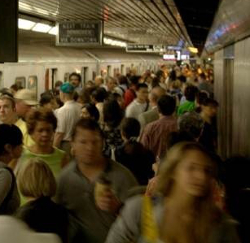
Let’s start with trips/million km operated (red), which measures how many trips are taken for each km a TTC vehicle drives—a proxy for crowding. This metric began 2003 at 2.10M trips, and ends off with 2.34M trips in 2012, a net rise of just over 10%. While the trend is upward, it’s interesting to note that it dives quite dramatically in 2008-2009, which likely has something to do with the nosediving employment picture prompted by the Great Recession—the TTC probably dialed back the amount of driving it did in order to cut costs, given less demand. Happily for the denizens of our city—if not the inhabitants of our underground—the employment picture has recovered since then, as have the number of trips/million km operated. But for each km a vehicle drives, there are more people onboard, which implies a higher level of misery due to crowding. In particular, km on the subway have grown only ~1% in a decade, so that misery on the metro is growing is all but assured.
Next, let’s look at vehicles/million km operated (green), which is a measure of vehicle utilization—a higher number implies that a given vehicle drives less in a year. In 2003, there were 13.4 vehicles/million km, while there were 14.1 in 2012. While this does not speak to whether or not vehicles are more crowded, it does apply to two things that every commuter implicitly cares about: vehicle wear and tear, and breakdowns. All else equal, a vehicle that is driving less will be in better shape from a customer point of view—less filthy, fewer torn straps and out-of-service air conditioners—and will break down less, meaning fewer delays. On that score, the TTC has improved notably since 2003, and almost without an interruption.
As for trips/vehicle (purple), this metric is another proxy for how crowded our commute is. Surprisingly, it rose steeply from 156k trips in 2003 until 2007, then fell off a cliff as presumably fewer bums occupied seats on the way to jobs that might not exist anymore. It is slowly resuming its ascent relative to 2003, at 167k trips in 2012, or over 5% over the decade. Unless buses are adding more seats—or people are getting skinnier—this metric indicates that our rides are more miserable than they were a decade ago. This is part and parcel of living in a growing city, of course, but it’s also rubbing salt in the wound when you consider how much more we’re paying for our trips.
Finally, if you look at million km operated (blue), which measures service frequency—or the number of routes operated—you see that the amount has risen sharply since 2003, especially between 2007 and 2009, going from 193M to 219M km. This has been almost entirely in bus routes. While these routes are becoming more crowded—as two metrics have shown—passengers are benefiting from either more frequent service, more routes, or—as is likely—both.
So, what can we conclude? We saw that trips/million km operated has been growing, which suggests more crowding on the available routes. This was reinforced by the fact that trips/vehicle have been growing, although vehicles were more crowded in 2007 than they are today. But we also saw that vehicles/million km operated have been growing steadily, and million km operated have grown quite starkly. In other words, consistent with Toronto’s growing cosmopolitan reputation, things are more crowded on the TTC, but the service is more frequent, and the places to see (or roads to travel) probably more plentiful. If you’re trying to go to work, then, you may not be a happy camper; but if you’re visiting the Distillery District on the weekend—or even the Science Centre—you might just be smiling a little. Does this justify the steep hike in fares, or the soaring operator pay? Probably not, as more riders should mean more revenues, sufficient to pay for enhanced—and no less crowded—service. Indeed, Toronto’s breakneck growth has been disastrously handled—why do we have so many new condominiums, but so few new subways, parks and services? But we can safely conclude that the TTC is not a system in decline—just one that is growing slower than everything else around it.
In our next post, we’ll look to the rest of the world—as Torontonians so frequently do nowadays—to ask how our subway stacks up against other great cities


