
Investing time in the design of the dashboard will help make the dashboard efficient, user friendly and aesthetically pleasing. Designing the dashboard from the perspective of the end user, designer and BI developer will help achieve this.
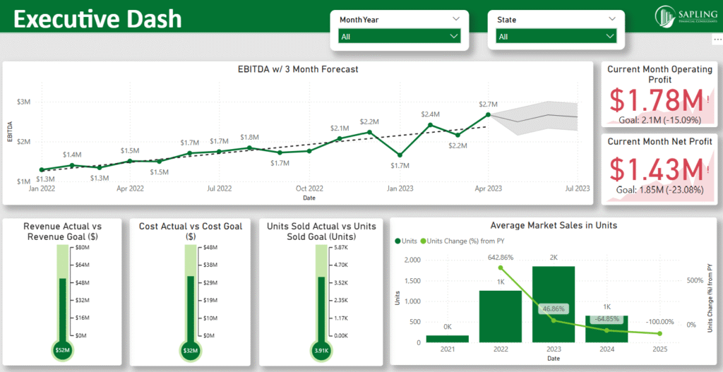
Exhibit A: Executive Dashboard sample
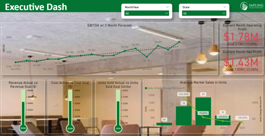
Exhibit B: Example of the difference a dashboard design can make.
As an end user
The easiest way to design a user-friendly BI dashboard is to envision the thought process of the end user while he/she is using the dashboard. For example, consider two KPIs: Customer review and Salesperson performance. A CEO would most likely check customer reviews first and later get inquisitive about which salesperson delt with that customer. In this scenario, a customer review table with a salesperson tooltip will be highly effective. However, a manager would process the same KPIs in a different manner during performance evaluations. He would check the salespersons’ performance first and check their respective customer reviews next. A salesperson’s performance bar chart with a drilldown to their respective customer review will be suitable for this scenario. The flow of information should align with the thought process of the end user. Keep in mind that in most cases, people want to see the answer right away and then get curious about the details of how you arrived at the answer. A landing page highlights key KPIs, followed by other pages with detailed breakdowns, enables the end user to process the information optimally.
As a designer
To build an aesthetically pleasing dashboard , it’s important to customize the dashboard as per the affinity of the end user and company standards. Additionally, ensure the dashboard is accessible to users with color vision deficiencies. Referring to the company’s website can help design the dashboard’s theme. Clear headers, consistent color schemes and simplified navigation with concise text instructions make the dashboard easy to learn. Apply Gestalt principles to design dashboards that are both efficient and visually intuitive. Avoid anything which makes the data difficult to read, such as noisy backgrounds or overly bright colors. Remember, uniformity and symmetry are key elements of aesthetic appeal. Be creative, gather user feedback and continuously refine the design to improve usability and effectiveness.
As a BI developer
An efficient BI dashboard is easy to understand and navigate. Charts are well organized, and space is utilized effectively. Also, the dashboard should be scalable in case additional data is added later. Using the right chart for each KPI is very important. For example, line charts work best for continuous KPIs, and bar charts are ideal for categorical KPIs. Features like tooltips and drill-throughs in BI tools like Tableau and Power BI can be used to manage space in the dashboard. Avoid information overload . For example, the KPI ‘Net Promoter Score (NPS)’ can be showcased in two different ways as shown in exhibit A and exhibit B For daily tracking, a detailed chart on exhibit A with promoters, detractors and passives might be unnecessary. Instead, a simple scorecard on exhibit B is often more effective.
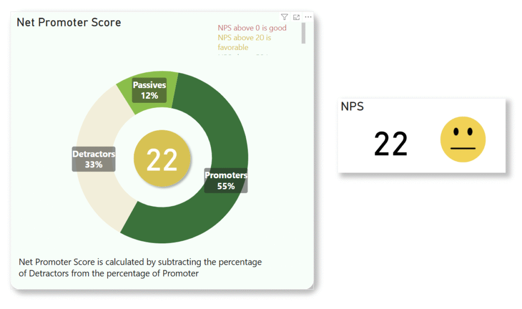
Exhibit C: Net Promoter Score (NPS)
Conclusion
Investing time upfront in thoughtful dashboard design not only ensures efficient usage and enriches user experience but also creates a scalable foundation that adapts to changing requirements. This strategic approach accelerates dashboard development, saves costly time and simplifies maintenance of the dashboard post development, ultimately delivering greater long-term value to both users and the organization.


