
When it comes to building FP&A reports, users often desire two distinct views of operational data.
On one hand, Key Performance Indicators (KPIs) should reflect the natural cadence of business operations, following the working week from Sunday to Saturday. These KPIs provide the user with actionable guidance for day-to-day management and meaningful comparisons between reporting periods, regardless of the distribution of days in the calendar.
On the other hand, traditional reporting often requires metrics to be captured on a monthly basis, aligning with the natural month-end financial reporting cycle. However, this approach may introduce distortions in week-to-week operational information due to stub periods at the beginning or end of the calendar month.
As a result, FP&A professionals often have to create two separate reports to track the same data to meet these distinct needs.
Fortunately, with Power BI, a powerful data visualization and reporting tool, we can address this need by allowing users to seamlessly switch between these two modes of reporting within the same visual, avoiding the need for additional reports.
Let us set up the problem in more concrete terms. Suppose a manager wishes to track the output of a production team, which is provided by the ERP in the following format:

In this scenario, the manager wishes to see the production output following the operational week (Sunday-Saturday) for the purpose of real-time monitoring and resource management.
Additionally, she also wants to have the ability to track output based on calendar month to furnish month-end reports. Therefore, if the working week extends from one calendar month to another, the production should be equalized across all working days and, on that basis, be attributed to the corresponding calendar month.
For example, the working week starting May 28 has three working days in May and two working days in June. Therefore, $120 could be attributed to May and $80 to June.
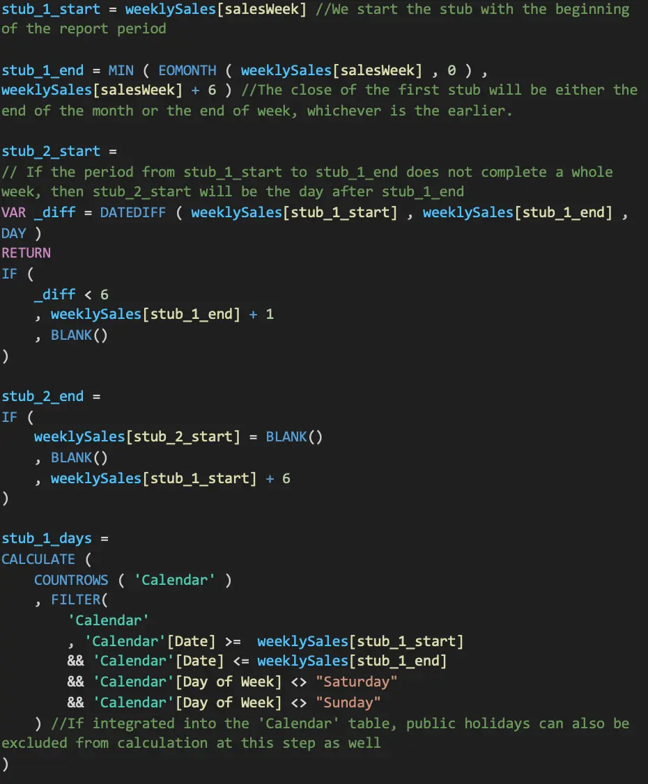
There are two main steps involved in processing the data to arrive at the desired reporting format.
First, we need to restructure the data to identify stub periods for each record and calculate the corresponding output values attributable to them. Second, in visualizing the data, we will leverage the DAX function ISINSCOPE to enable dynamic calculations depending on user selection.
The first step is to create new fields in the data table to calculate the working days in each stub period. Within Power BI, this can be achieved by creating the following Calculated Columns:
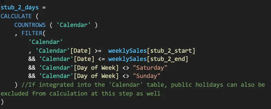
With the in-between weeks divided into in-month portions, we are ready to calculate the sales numbers attributable to each month, as applicable:
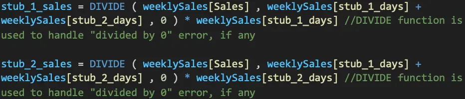
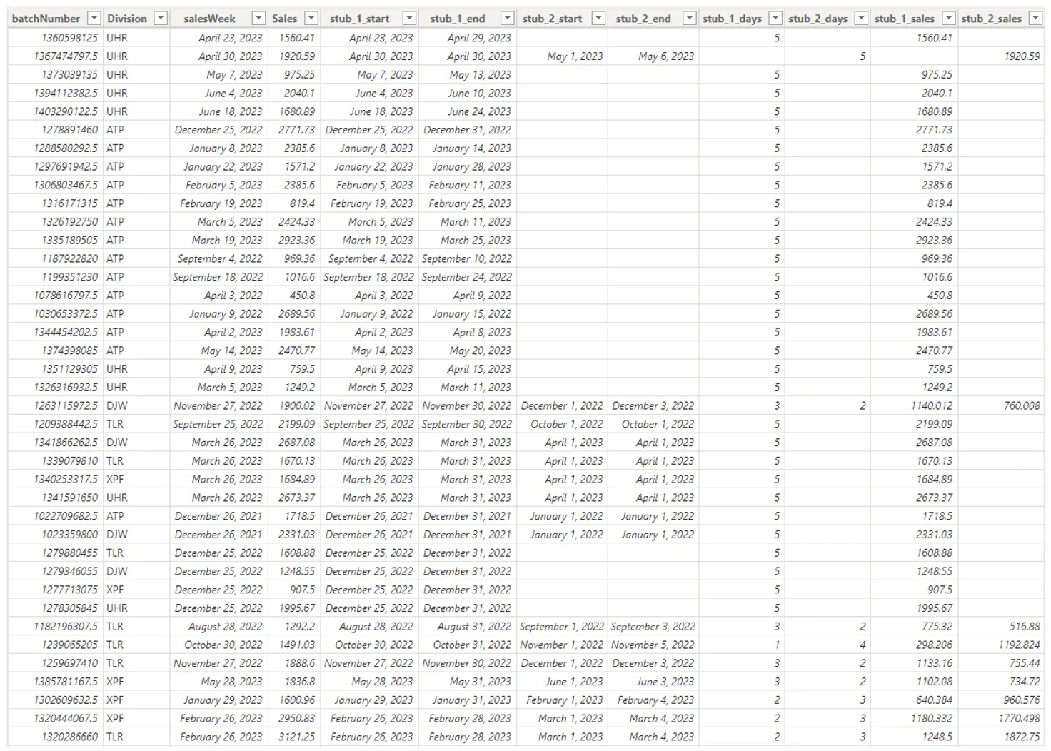
At the end of this step, we have successfully apportioned each reporting week’s sales numbers to their respective month:
Having restructured the data, the second step is to construct a DAX formula that can enable dynamic switching between different calculation logic depending on the user’s selected view. In other words, when the user filters by week, the metrics should display the total sales amount by working week.
As our sales data is grouped by week, the calculation is as simple as:

Conversely, when the user filters by month, the metrics should display the total by month. To arrive at this metrics, we have to add up the data apportioned amount from each row that is attributable to the selected month.
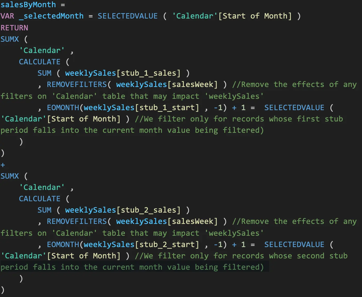
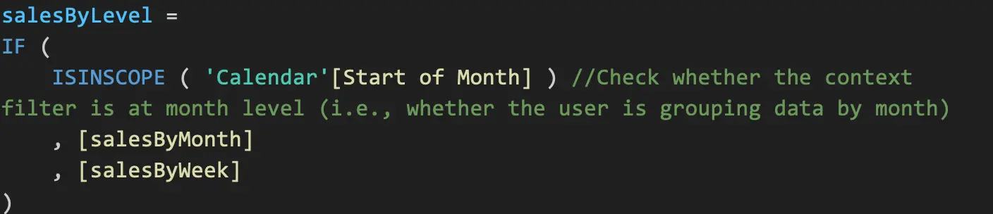
Finally, we will leverage the logical function ISINSCOPE to enable user to toggle between two calculation approaches depending on whether they group the data based on weekly sales or monthly sales:
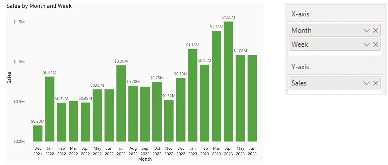
We can then place the final measure in a column chart with the below configuration to enable the toggle between month- and week-level view.
In this setting, the default view will be month-level aggregation. While the original data is grouped by week, the visual reflects the adjusted calculation while taking into account the fact that some weeks may include days from different months.
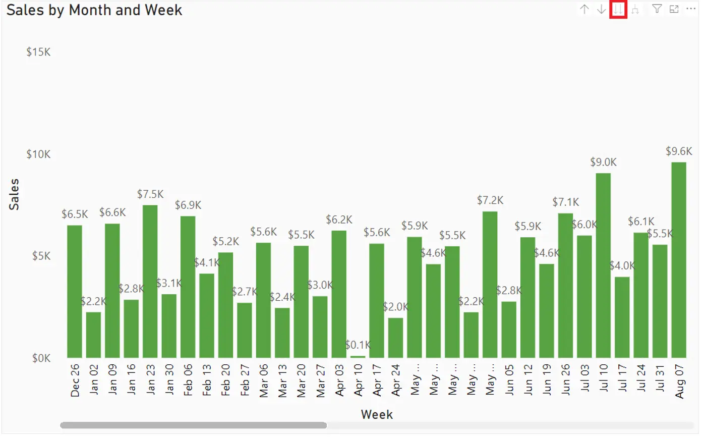
However, once the user drills down the next level of hierarchy (Month to Week), the visual will display the sum of sales amount on a weekly basis, reflecting the original structure of the data.
The difference can be easily verified by comparing side by side the results of using the dynamic, two-layered sales measure and the straight sum approach (i.e. running a SUM function on weeklySales[Sales] column.

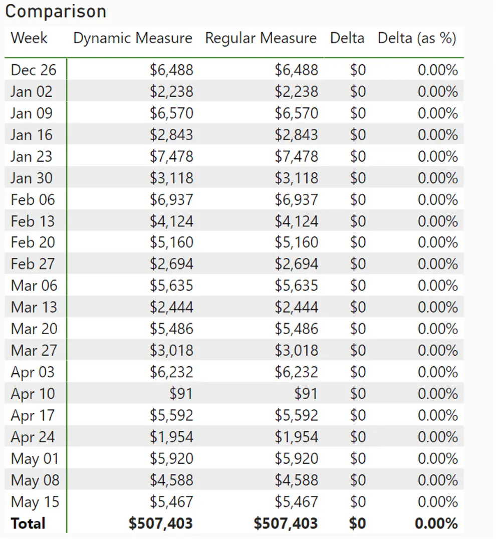
Note: Table is truncated for visibility
Note that at the week level, the dynamic measure returns the same result as regular measure. This is to be expected, as they are simply the SUM of weeklySales[Sales] column when grouped by the start of the week.
However, the similarity ends when the user activates the month-level grouping. As we can see from below, the regular measure tends to overstate the sales number of a given month, sometimes up to 30%.
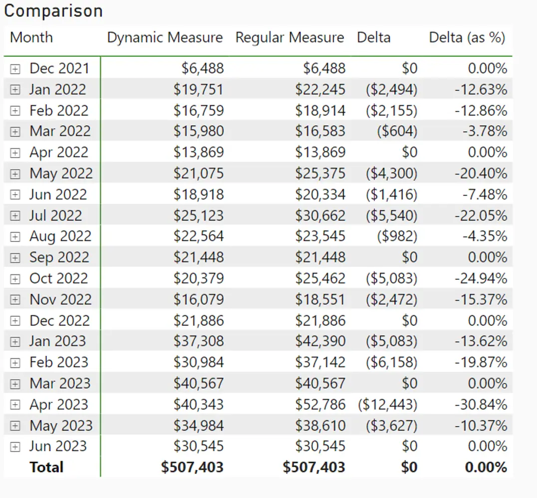
Note: Table is truncated for visibility
This is because in most cases, production in the next month is counted toward the previous month’s total due to the weekly grouping of production, which does not account for month-to-month transition. As a result, monthly aggregation of sales data will incur some distortion during reporting period, even though the final tally at year end reconciles.


